PROBLEM
Users found the dashboard creation process slow and complex, often taking hours or days to complete. How might I help users process survey data and build insightful dashboards more easily?
BREAKing down THE problem
data_table
Confusion around creating dataset
Users struggled to comprehend the necessity of setting up datasets
blur_off
Built Without Best Practices
Missing dashboard best practices hinders data clarity and insight
credit_card
unsuccessful up-selling
Poor usability kept Alida customers from adopting Alida Analytics
solution
To address challenges users faced in creating dashboards and processing survey data, I led a redesign of Alida Analytics using a persona-driven, user-centered approach. The new experience reduced dependency on setting up datasets—an intimidating step for non-technical users—while preserving advanced functionality for power users.
impact & outcome
Improved Design Efficiency & Customer Satisfaction
The changes I made were well-received by customers after five usability tests confirmed the effectiveness of the new design. Improved usability sparked customer interest and opened up upselling opportunities.
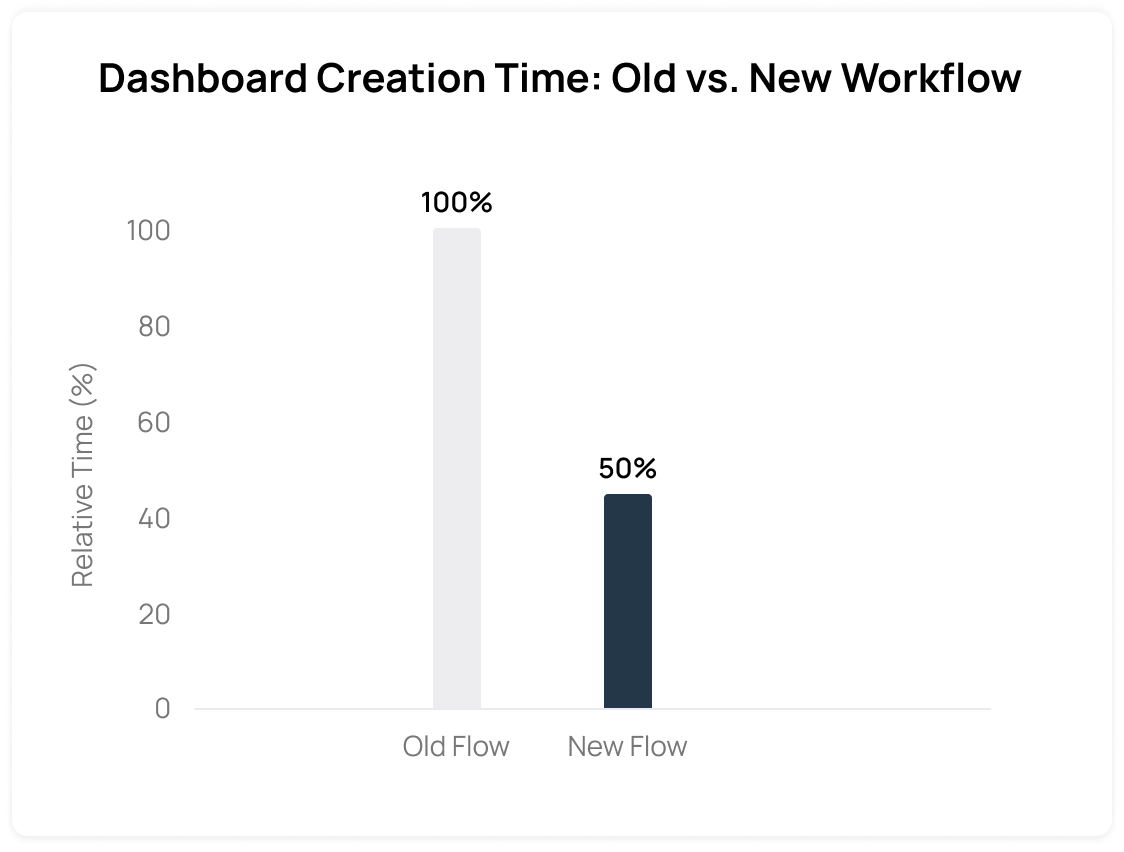
- The time to create a new dashboard using new workflow was cut down to half compared to using the old workflow. (The same data sources were used for both workflow.)
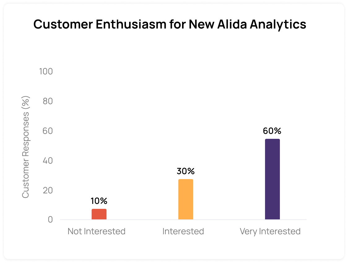
- The existing customers were using the MVP of new redesigned dashboard and they showed much enthusiasm to purchase Alida Analytics to receive better insight from the surveys.
BACKGROUND
AI powered Customer Data Analytics Platform
Alida Analytics is designed for enterprise clients who want end-to-end visibility into critical customer experience metrics. With the platform, enterprises have access to real-time, role-based, mobile dashboards that are completely customizable and easy to distribute and share.
- My Team
- Senior UX Designer
- Senior Product Managers
- Web & Mobile Engineering Teams
- Role & Responsibilities
- Led end-to-end from design strategy to execution
- Scaled Alida Design System
- Project Timeline
- 2024 - 2025
process 1 of 5: Discovery
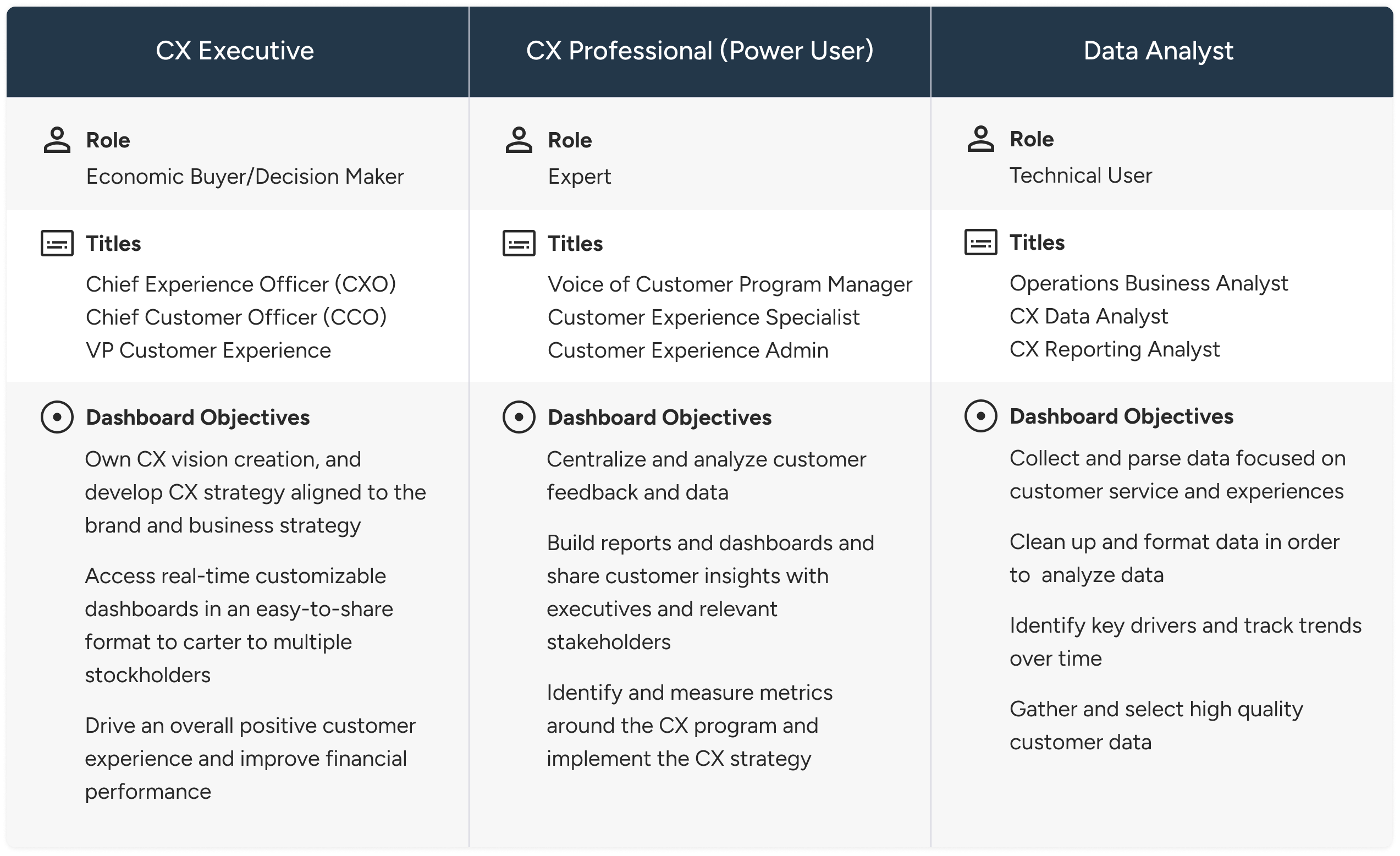
Persona-driven Approach to Dashboard Design: Usability Testing and Analysis
I created three product-focused UX personas based on user research and collaboration with Marketing and Customer Success, aligning our insights with their existing personas. This cross-functional approach ensured the personas reflected real user goals and supported dashboard design decisions.
process 2 of 5: ideation
Exploring User Flows to achieve the goal without setting up Datasets
To evaluate the need for datasets in the workflow, I designed two user flows—one requiring datasets and one without. While datasets allowed merging data across activities, similar outcomes could be achieved more simply by selecting sources directly.
process 3 of 5: exploring concepts
Exploring UI Concepts for Adding Data Sources
After validating the new flow, I began exploring UI concepts to simplify data source selection and reduce the friction non-technical power users faced with dataset creation. Both concepts were designed as guided, wizard-like experiences, breaking the process into manageable steps with subtle differences in behavior and interaction.

The first concept allows users to select surveys from each source and see them populate a panel beside the data list.
The second concept introduced drag-and-drop functionality to transfer selected surveys to the panel; however, it posed usability challenges and received negative feedback from the engineering team due to its complexity.
process 4 of 5: design implementation
designing for long-term engagement
Dashboards are not just one-time setups—they’re where users spend most of their time. So, I designed a dashboard experience that supports clear distinction between view and edit mode to help user preventing to unintional changes, inconsistent styling, and data misinterpretation. For example, Edit Mode enables drag-drop, resizing, widget editing, and configurationView Mode is clean, interaction-safe, and optimized for consumption
process 5 of 5: Refinement & Personalization
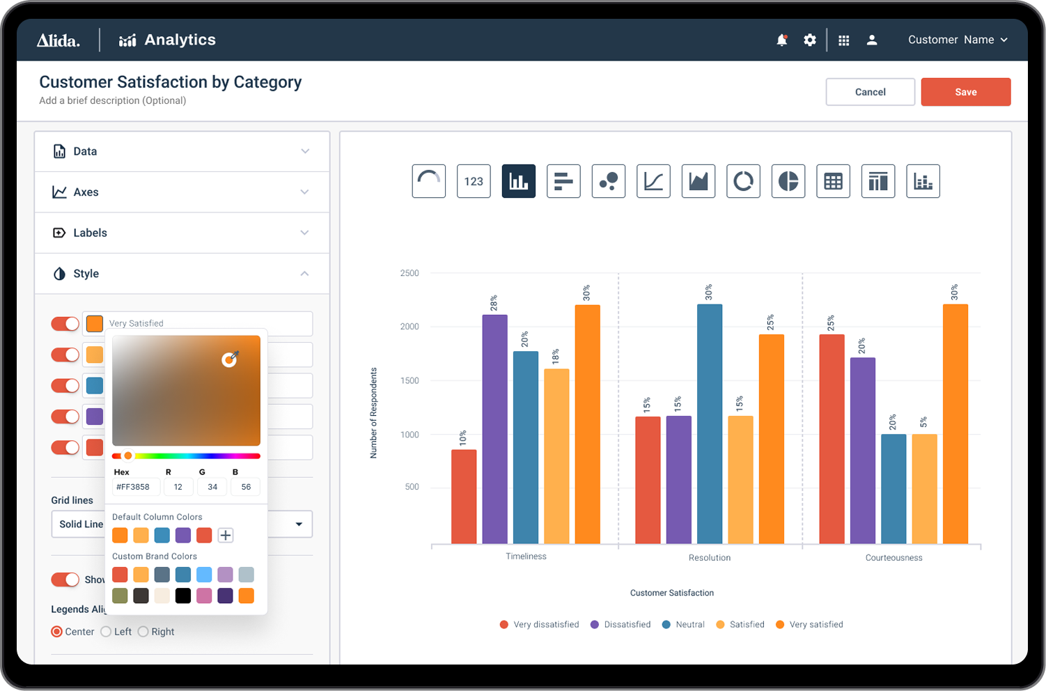
widget customization & Color palettes
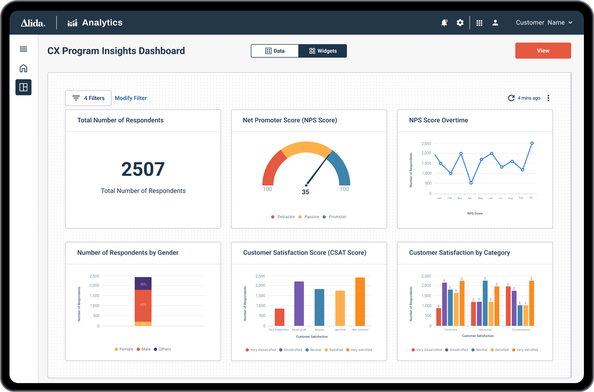
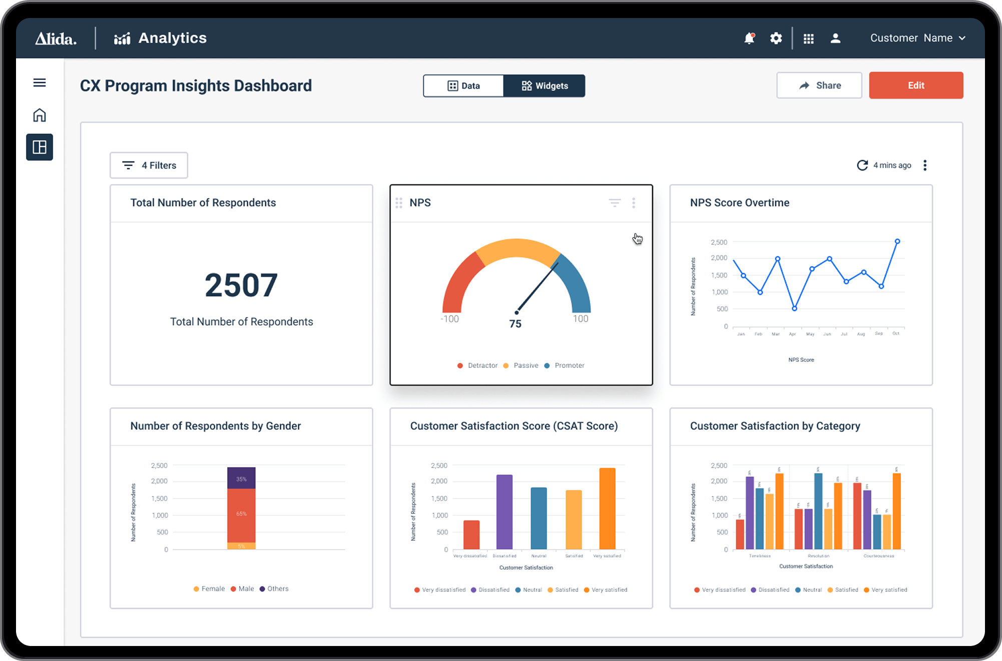
To fix inconsistencies in Alida’s legacy dashboards—where multiple chart libraries were in use—I led a full audit with PMs, designers, and developers. We standardized on a single charting library and curated chart types tailored to CX workflows, focusing on visualizations that track customer health, feedback loops, and NPS trends.
For accessibility and brand alignment, I introduced widget customization with progressive disclosure: default settings for quick use, and advanced options for power users to fine-tune labels, colors, themes, styles, and even data logic.
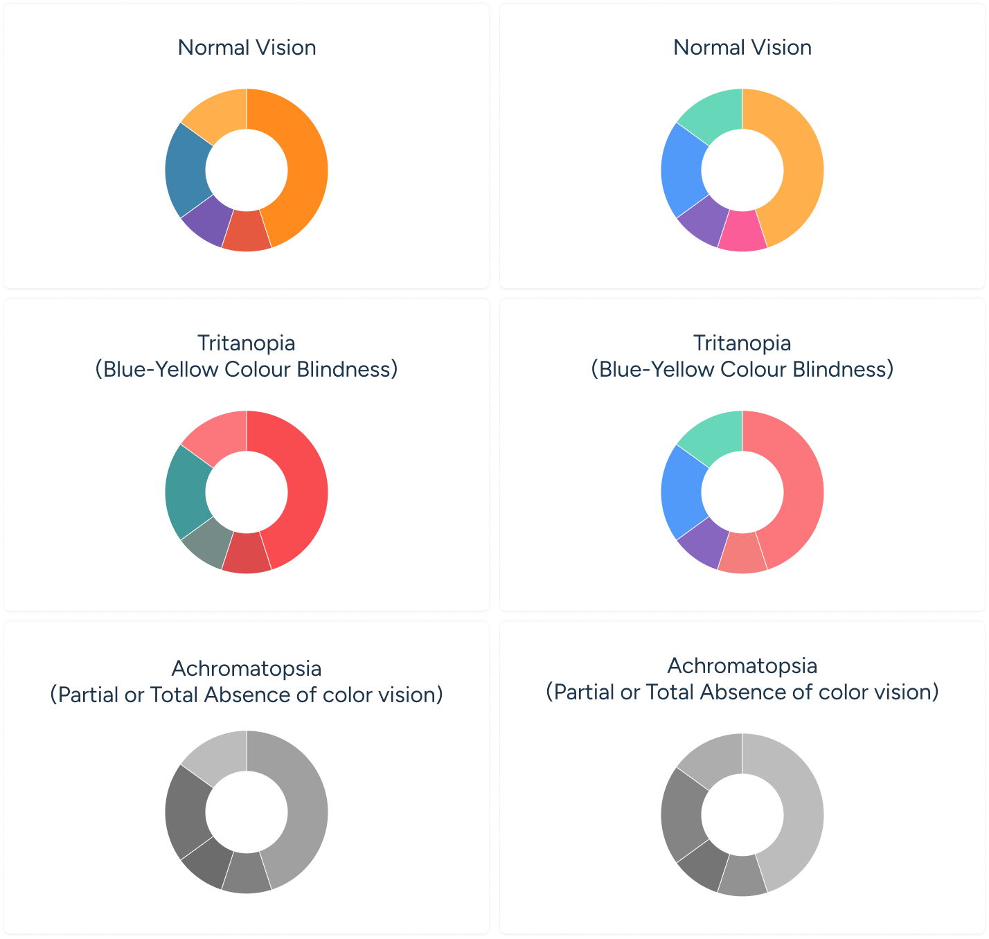
Designing color palettes
I explored various data-friendly color palettes and settled on two options: a lighter tone and a darker tone. I opted for the darker tone to align with our company's brand identity, conveying a bold and clear visual style suitable for an enterprise app. These colors were also designed to be color-blind friendly.
(Below are Option 1 and Option 2 as seen by individuals with color blindness.)
other key features: collobration
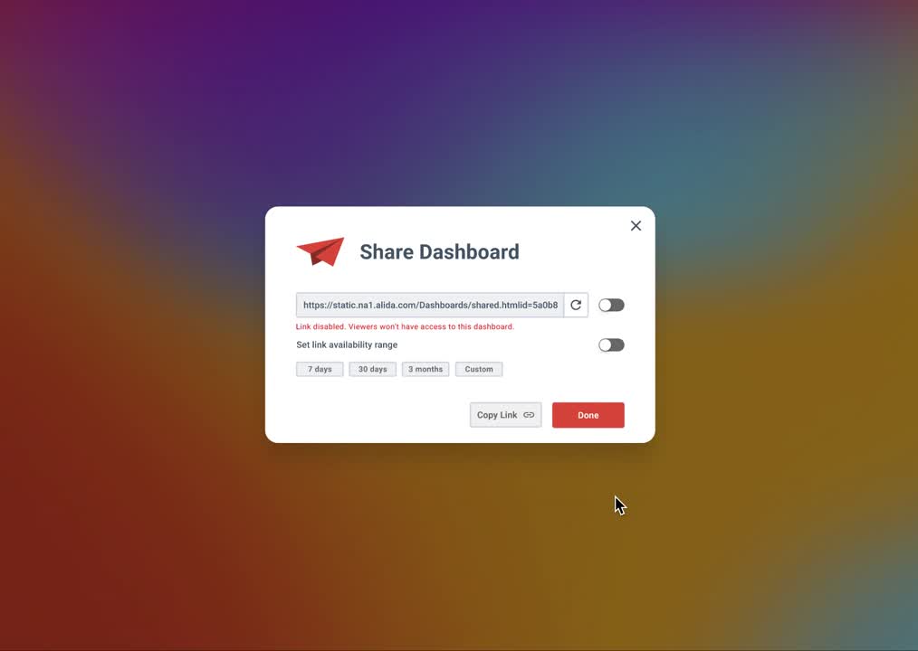
Sharing a Dashboard
When designing dashboard sharing, I focused on clarity, control, and security. Users needed flexible ways to share across teams without risking unwanted edits or data exposure. I implemented role-based permissions, clear sharing states, and smart defaults (view-only by default). Visual indicators, instant revocation, and lightweight share links helped users collaborate confidently while protecting data integrity.
Designing for Mobile Access
To support CX executives—key decision-makers who often access insights on the go—I prioritized a mobile-first experience for dashboards. Executives needed to quickly scan key metrics at a glance, so I optimized layouts for small screens, simplified interactions, and emphasized high-level summaries over granular controls. This ensured they could stay informed and make timely decisions, whether in meetings or between flights.
Alida Design system
For Alida Analytics, I contributed to extending the Alida Design System to support new dashboard and data visualization needs. I designed reusable components—such as tables, widget controls, layout grids, and color palettes—that aligned with the existing system while meeting the specific interaction patterns of the Analytics platform. This allowed our team to build faster, maintain consistency, and ensure accessibility across complex, data-heavy interfaces.
Reflection
What is Next
Working on Alida Analytics was one of the most challenging projects as data analytics was new domain for me. Despite the complexity, working with talented colleagues and positive feedback on the redesigned dashboard from delighted customers were rewarding.
The product revamp and updated features from Alida Analytics were deployed and successfully launched together with other features from Alida Product Suite on different platforms: Web Application , & Mobile Apps.


.png)